
Paragraph Component
The Paragraph Components allows content editors to choose which kind of pre-defined paragraphs they want to place on the page and the order in which they want to place them. If you would like training on how to use the components below, please feel free to reach out to Prem Nankoo at pnankoo@ccny.cuny.edu to schedule a web training session.
List of Available Paragraph Components
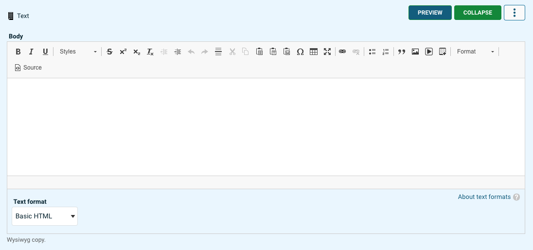
Text
The text component is also known as Wysiwyg (What You See Is What You Get) will allow content editors to edit content without touching a line code.
Heading
Allows for adding a section header
Accordion
Display various types of content, with accordion-like behavior. Items in accordion groups will appear collapsed with only their titles showing. Clicking an item's title will expand and reveal its whole content.
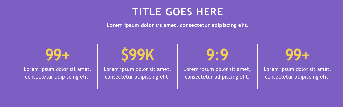
Fast Facts
A unique format to highlight important data on a basic page layout.
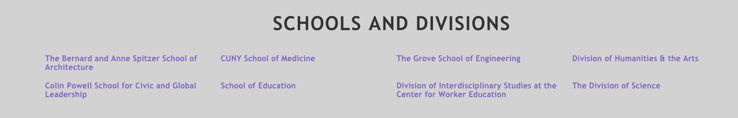
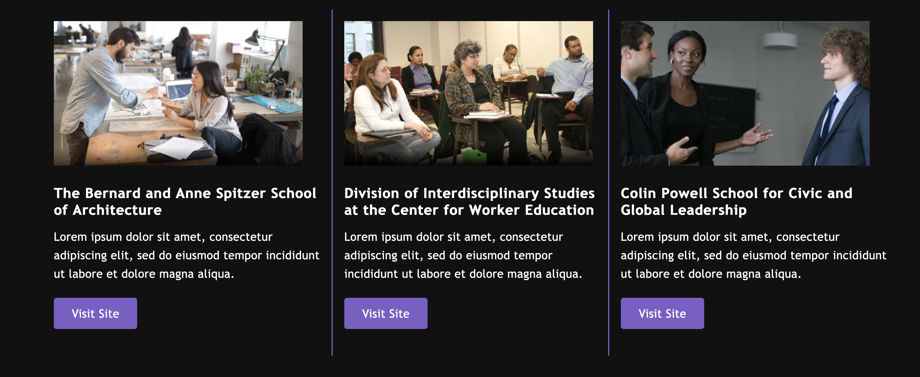
Schools and Divisions
This component allows a content editor to display other sub sites on their page in a unique format.
This works great for a content editor who manages a division sub site because they can now showcase all the programs within that division on their homepage.
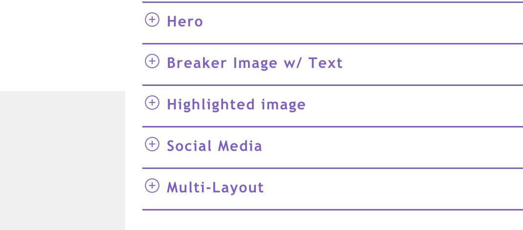
Hero
A slider that allows you to display rotating images.

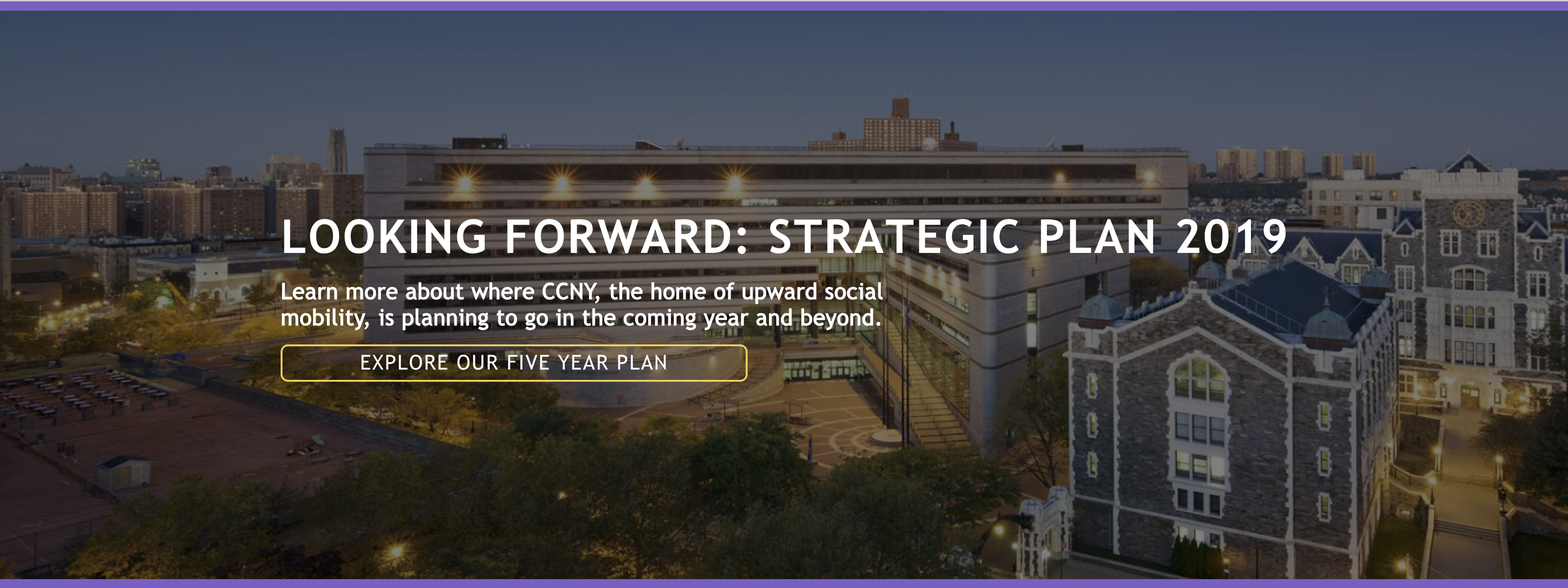
Simple Callout with Background Image
A horizontal strip that is used to convey important messages, promotions, or announcements.
Breaker Image w/ Text
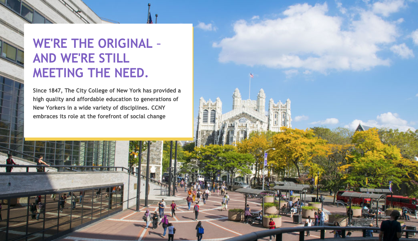
Highlighted image
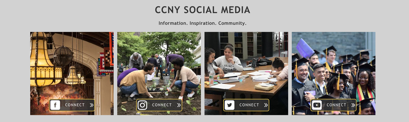
Social Media
Promote your social media* by uploading a static image and linking to the social media platform.
*This is not a live feed feature
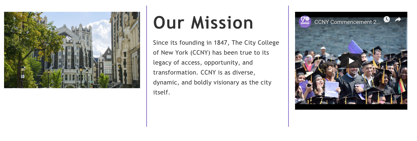
Multi-Layout
Multi-Layout allows a content editor to take a chunk of content and flow it into multiple columns, similar in a newspaper.
Example of 2 column layout
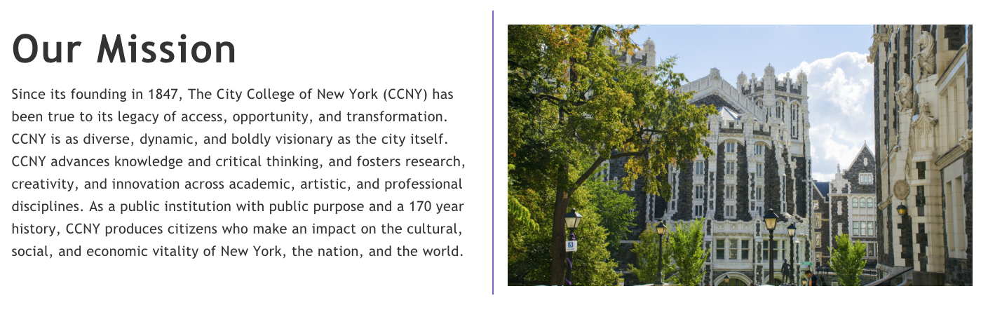
In the case of a two-column layout, you can choose if the first column should be 25%, 50%, or 75%
Example of 3-column layout
Multi-Column Full-Width
Similar to the Multi-Layout component, which enables content editors to distribute a piece of content across multiple columns resembling the layout of a newspaper, the Multi-Column Full-Width feature applies a full-width dark gray background and reverts the text to white.]
Example of 3-column layout
Example of 2-column layout
In the case of a two-column layout, you can choose if the first column should be 25%, 50%, or 75%
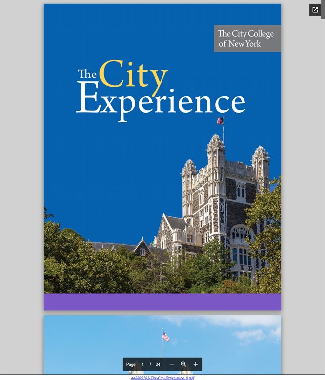
Document Embed
This component allows you to embed a document, spreadsheet, or presentation that you upload into a web page. A link to the original document is always provided at the bottom.
Vector Icon Set
The vector icon set component provides the flexibility to add a URL link to an icon on a web page layout. Icons are custom SVG files that reflect the CCNY brand created by the Office of Institutional Advancement and Communications. A content editor should reach out to Prem Nankoo or Seamus Campbell to set up the icons.
Please note, as a content editor, you will not have access to upload or select icons, but you will have the option to rearrange the icons, title, and link.
View a list of available icons
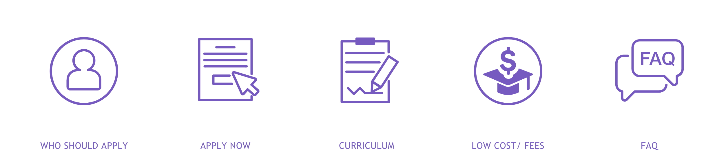
Details with Icon Set
This component enables you to split the page into two sections: content on the left and icons on the right. The icons provide clickable links for users to navigate to other pages. It's worth noting that there's a library of icons accessible to all content editors. If the existing icons don't suit your needs, please feel free to contact the web team. We'll design new icons and integrate them into the library.
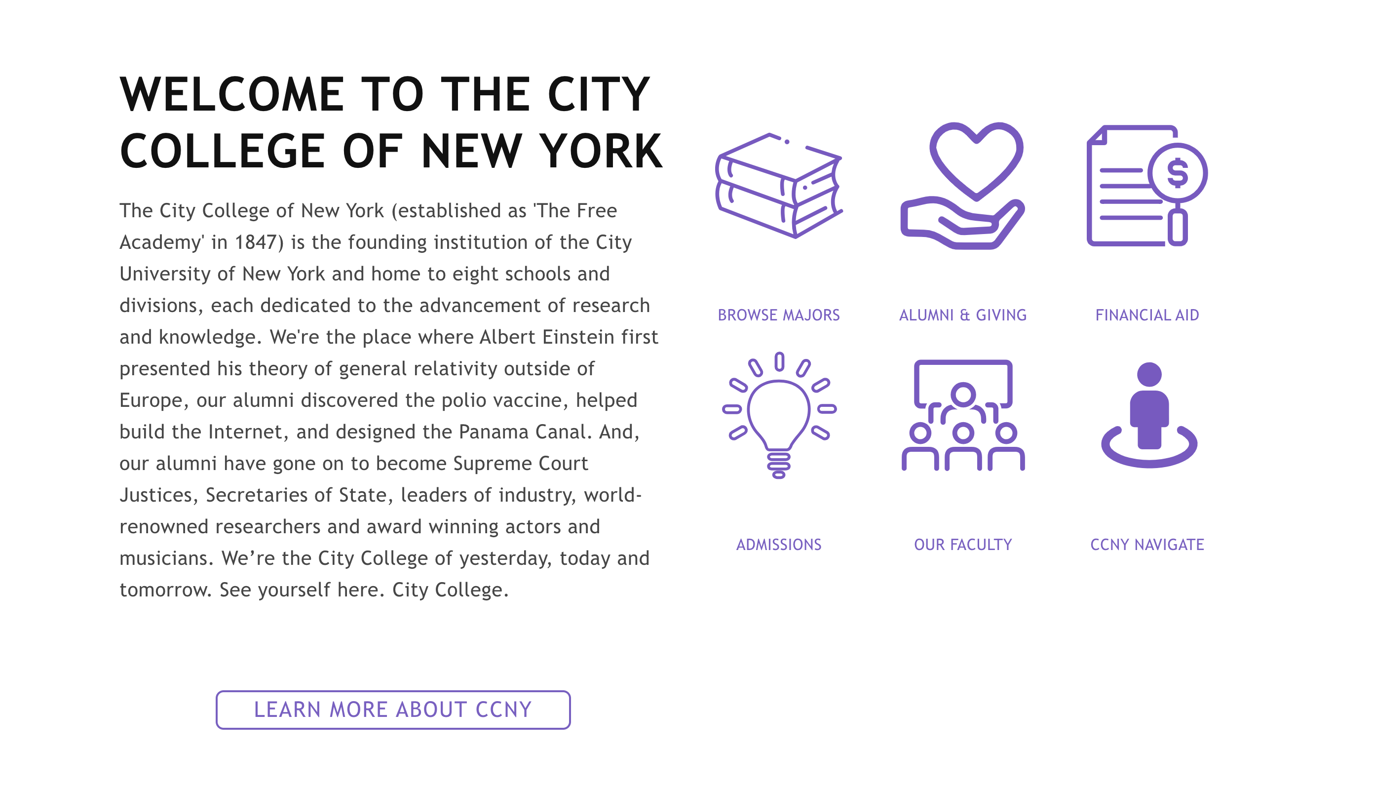
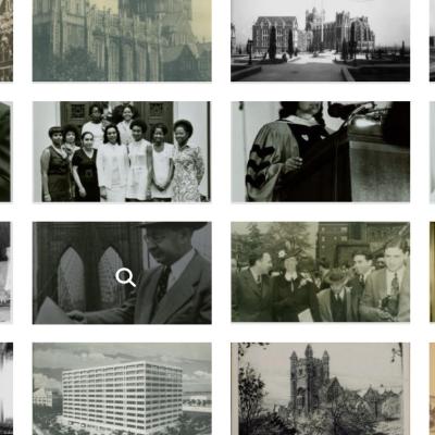
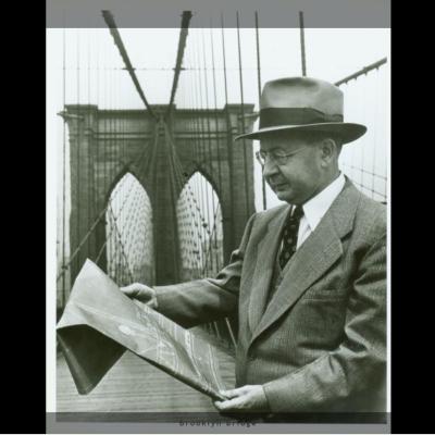
Image Gallery
Display images in a gallery format
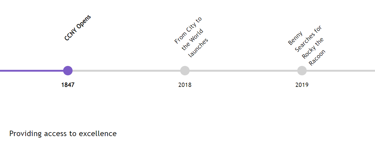
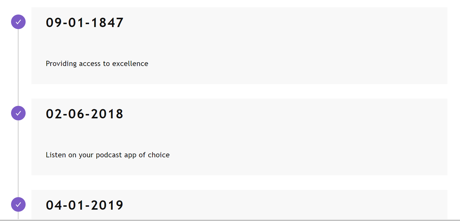
Horizontal/Vertical Timeline
Display a list of milestones in a timeline format
Divider
Adds a line between sections, in a variety of colors, to create a visual divider between paragraph components.

Button
Adds a button hyperlink as a standalone paragraph.

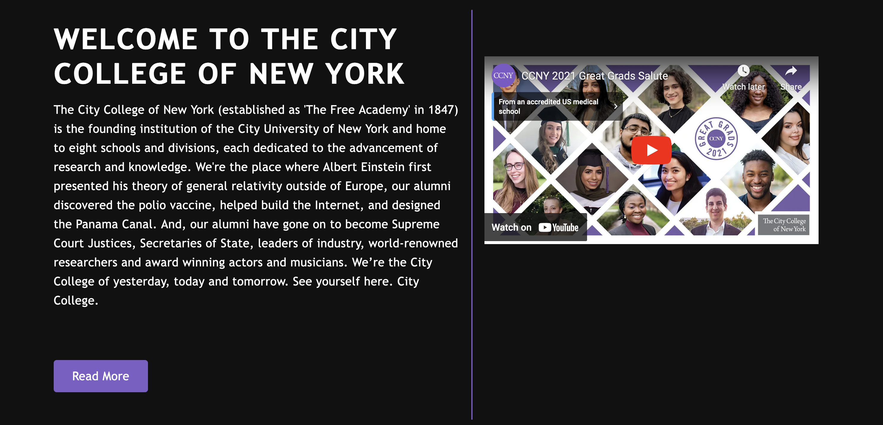
YouTube Video
Adds a YouTube video embed.

Vimeo Video
Adds a Vimeo video embed.
Note: Videos must be captioned or will be subject to removal

Last Updated: 03/25/2026 14:23